

The COVID19 pandemic is now moving quickly. While northern Italy has been overwhelmed by infections, Spain and Iran are also now experiencing a disaster. Here in the United States, there are serious outbreaks in Seattle and New York. So what are the best maps and other data visualizations to keep track of what is happening? Here are my top recommendations:
Global Level Data- 冠状病毒数据
This John Hopkins map provides a global look at COVID19’s spread, combined with charts of country cases, as well as the number of dead and recovered. I would guess that this is one of the three most popular maps for tracking the pandemic.
Outbreakinfo is an outstanding dashboard, which provides a vast amount of information in a limited space. This is one of the top three sources for tracking the pandemic.
The Worldometer Coronavirus webpage has a plethora of charts with data on the outbreak, in particular country by country data on infections, new infections, deaths and recoveries.
Health map provides another global map of the outbreak, although it is not accompanied by the data in charts that accompanies the John Hopkins’ map above. It does have, however, an “animate spread” feature that shows a visual history of the virus’s spread, which is hypnotic.
The University of Washington novel Coronavirus map is similar to the John Hopkins map, but has a less cluttered (and less detailed) collection of data in charts.
A US high school student created this useful website with COVID19 data both globally and in the United States.
The United States
This dashboard is simply outstanding for information on United States. It says that it was “made with love by first generation Chinese immigrants.” Like the John Hopkins map it combines charts with a map (scroll down) to provide comprehensive coverage of COVID19 in the US. If I was only going to bookmark two websites, I would bookmark this one and the John Hopkins website at the top of the list above.
If you are looking for testing information, you cannot do better than the NYT’s “The COVID Tracking Project.”
For key information, the map at the Center for Disease Control is an official source. The website is farily basic visually, which makes it less useful to quickly find information than Italy’s website, or most other national-level sources regarding this pandemic. The website is now updated on weekends: “On Saturday and Sunday, the numbers in COVID-19: U.S. at a Glance and the figure describing the cumulative total number of COVID-19 cases in the United States will be updated. These numbers are preliminary and have not been confirmed by state and territorial health departments. CDC will update weekend numbers the following Monday to reflect health department updates.”
U.S. States
The Daily Data Summary of New York City provides basic data regarding the city’s outbreak.
Some state sites for COVID-19 are bare bones. For example, here is a link to the MA state COVID-19 website.
Here is a great dashboard for tracking Florida’s COVID-19 outbreak.
Projections for the United States
This Institute for Health Metrics and Evaluation (IHME) website is attracting a lot of attention on social media. It provides COVID-19 projections both for the United States and for individual states. This is what the site says about the origin of this project: “IHME’s COVID-19 projections were developed in response to requests from the University of Washington School of Medicine and other US hospital systems and state governments working to determine when COVID-19 would overwhelm their ability to care for patients. ”
China
For anyone who wants to track COVID-19 data in China, this is the best website (and map) that I know, but it will be most useful for Mandarin speakers. 这是中国冠状病毒的最佳图谱。The English version of this website has global data.
Korea
The main Korean government COVID-19 website not only provides information on COVID-19 in Korea, but also compares Korea’s case counts to that of other nations. The website is available in Chinese, English and Korean.
European Union
The European Centre for Disease Prevention and Control situation update gives the basic epidemiological data for the EU. The main COVID-19 page provides access to a long list of resources.
Italy
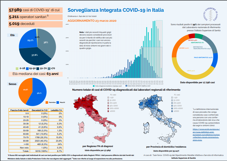
Italy unquestionably has one of the best dashboards of any nation, with both maps and charts. When you head to this site, you should click on the link for Infografica giornaliera. This link has a PDF document with the day’s maps and charts. Obviously, this site is in Italian. Check out a copy of their data at the bottom of this post for an idea of their format. Perhaps the CDC could adopt this template?
Great Britain
You can find key COVID-19 data at this government website.
Germany
This site has an incredibly detailed map of COVID-19 data. If you are looking at hospital bed availability, this incredible map has detailed information.
Canada
The “COVID Canada map” provides charts of cases by every Canadian province, as well as the country as a whole. While useful, it only provides case counts, although this data can be presented in different formats.
The Canadian Coronavirus map provides a good nation-wide visual of COVID-19 cases.
The Globe and Mail has some great data visualizations. You can see their data for Canada -which they say will be updated three times a day- here.
Canadian provinces
British Columbia has done an excellent job of testing early in the pandemic, under the lead of some outstanding health authorities. The province’s health data for COVID-19 can be found here.
Quebec’s regional case count can be found at this Quebec government website. This website is quite basic.
More
Want to find more maps or data dashboards? You can also find a list of maps recommended by the Center for Infectious Disease and Policy (CIDRAP) at the University of Minnesota here. Many are already listed above. But the best tool is the CIDRAP website itself.
I hope that everyone reading this, wherever you may be, stays safe and healthy. Take care of yourselves. And remember not to stare at these dashboards too much.
Istituto Superiore di Sanità, Government of Italy.