Italy

Italy, language learning and travel

One of my favorite things in life is language learning, which for me entails studying both Portuguese and Chinese. I don’t think that I am naturally good at languages; I just enjoy studying them. I have no ambitions to become a polyglot. I think that studying Chinese in particular will take me the rest of my life. I currently have five one hour language study sessions a week, which is how I distract myself from all the responsibilities and challenges of my work and daily life.

I think that we are living in the golden age of language learning. There are more tools to study a language than ever before. And with online platforms like Preply and iTalki it’s easier than it has ever been before to study a language. No longer do you have to find the one Portuguese speaker in your town. You can create an immersive experience with language tutors, YouTube or BiliBili. Of course, everyone learns differently, and for many people the structure of a regular class is both familiar and helpful. I’ve just posted an interview with Dr. Kathi Ketcheson on my podcast, Dispatch 7. We talked about how she came to fall in love with Italian, her experiences teaching Italian in community education, why language learning matters, and how her language study and her travels in Italy are connected. If you are curious to hear her interview, you can listen to it here.

Shawn Smallman 2022

Maps, Charts and data for COVID-19

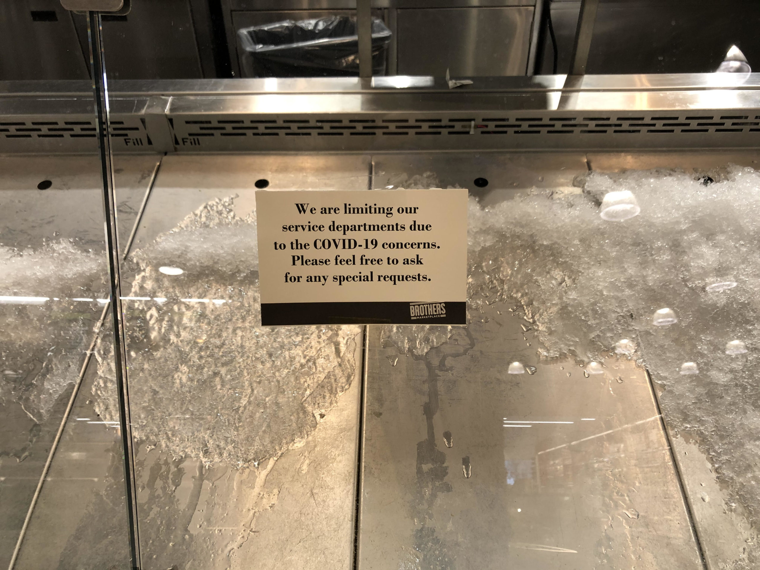
Local market sign in Cambridge, Massachusetts, March 17, 2020

The COVID19 pandemic is now moving quickly. While northern Italy has been overwhelmed by infections, Spain and Iran are also now experiencing a disaster. Here in the United States, there are serious outbreaks in Seattle and New York. So what are the best maps and other data visualizations to keep track of what is happening? Here are my top recommendations:

Global Level Data- 冠状病毒数据

This John Hopkins map provides a global look at COVID19’s spread, combined with charts of country cases, as well as the number of dead and recovered. I would guess that this is one of the three most popular maps for tracking the pandemic.

Outbreakinfo is an outstanding dashboard, which provides a vast amount of information in a limited space. This is one of the top three sources for tracking the pandemic.

The Worldometer Coronavirus webpage has a plethora of charts with data on the outbreak, in particular country by country data on infections, new infections, deaths and recoveries.

Health map provides another global map of the outbreak, although it is not accompanied by the data in charts that accompanies the John Hopkins’ map above. It does have, however, an “animate spread” feature that shows a visual history of the virus’s spread, which is hypnotic.

The University of Washington novel Coronavirus map is similar to the John Hopkins map, but has a less cluttered (and less detailed) collection of data in charts.

A US high school student created this useful website with COVID19 data both globally and in the United States.

Privacy & Cookies: This site uses cookies. See our Privacy Policy for details. By continuing to use this website, you agree to their use. If you do not consent, click here to opt out of Google Analytics.